BRIEF
A comprehensive company rebrand for “In the White Room.” This was an in-house branding project.
To kickstart the project, 3 concepts were created, this was early stage design focusing on the idea rather than the final logo, from these one was to be selected and worked up, school to see more …
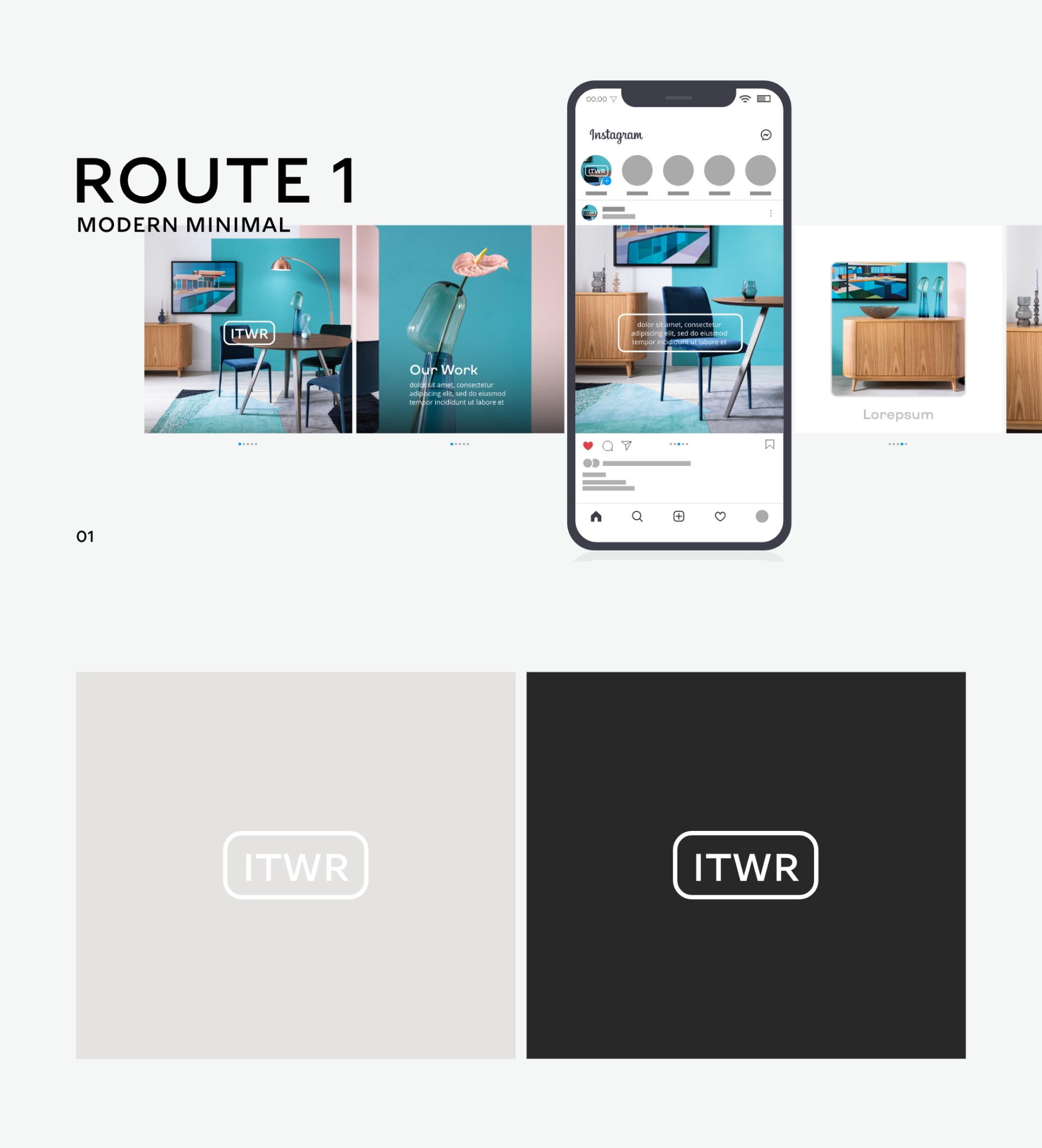
Route one focused on friendly curves, this more friendly approach to the project was meant to represent the companies friendly approachable service. The colours selected were muted this was to allow the creative to do the talking in any branding context.
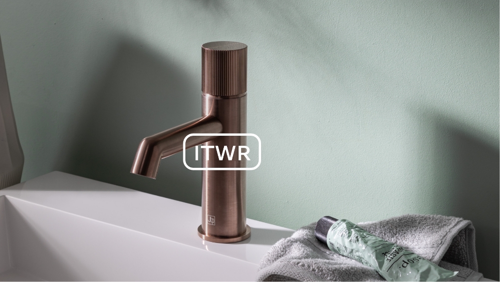
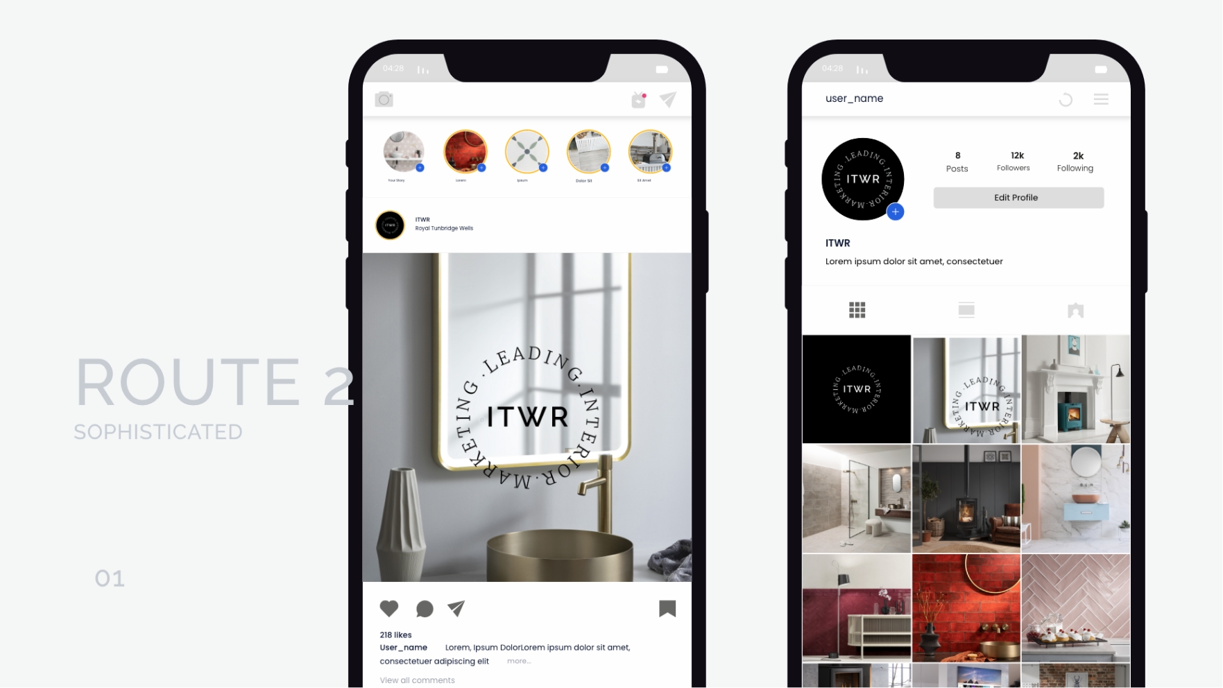
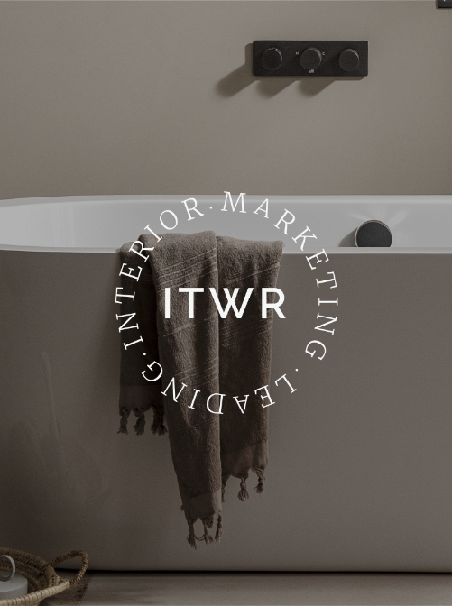

Route 2 was the heritage approach, since the company works with a lot of high end clients, this design looked at positioning the brand as a more high end service.
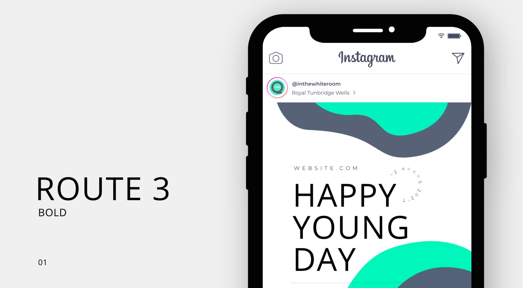
The Final concept, route 3, was a more modern approach focusing on illustrating the company’s service
INSPIRATiON
A Bold approach would be new for ITWR, being the leading interiors Specialist PR agency I think we have the right to be loud. The Idea focuses on a speech bubble and represents the service we provide for our clients, digital communication and public relations is what we do best.

This project caught my eye for inspiration, The bold colour choice really grabs the attention of the audience, among many other branding projects this stood out to me due to its bold nature and reference to communication.
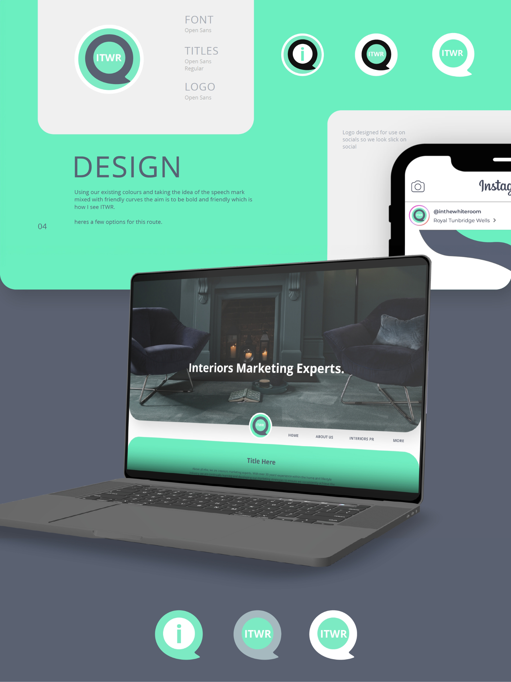
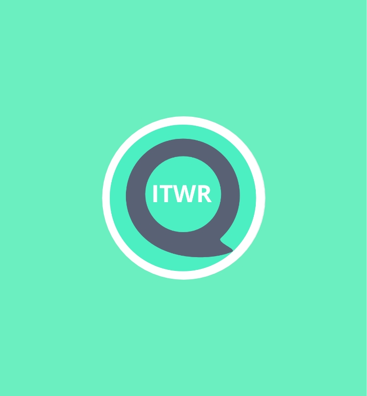
Winning concept
Route 3 was selected by the client as the winning concept due to its representation of the service whilst presenting it in a friendly and meaningful way.
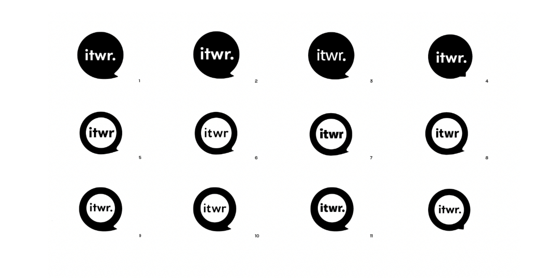
Development
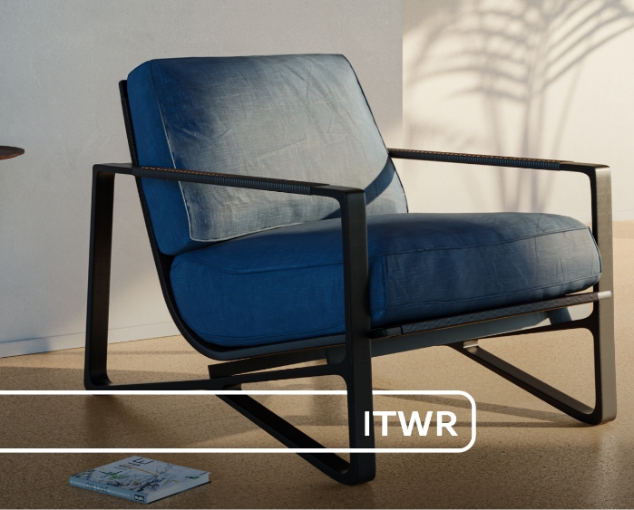
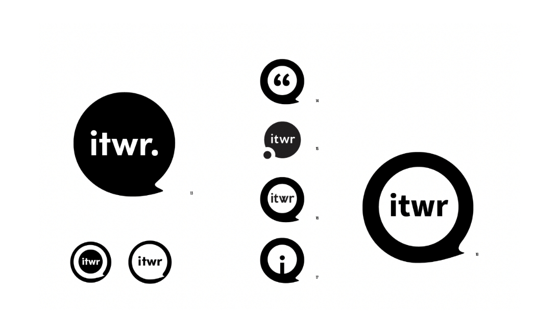
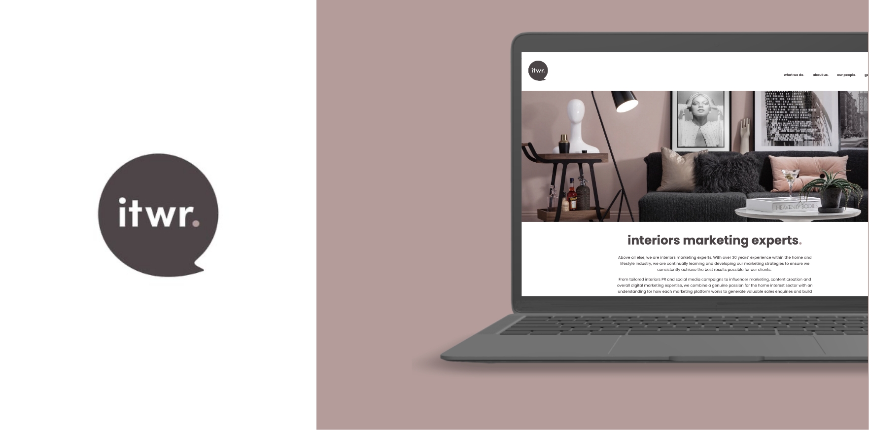
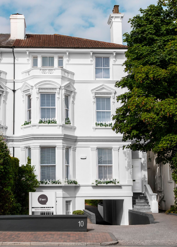
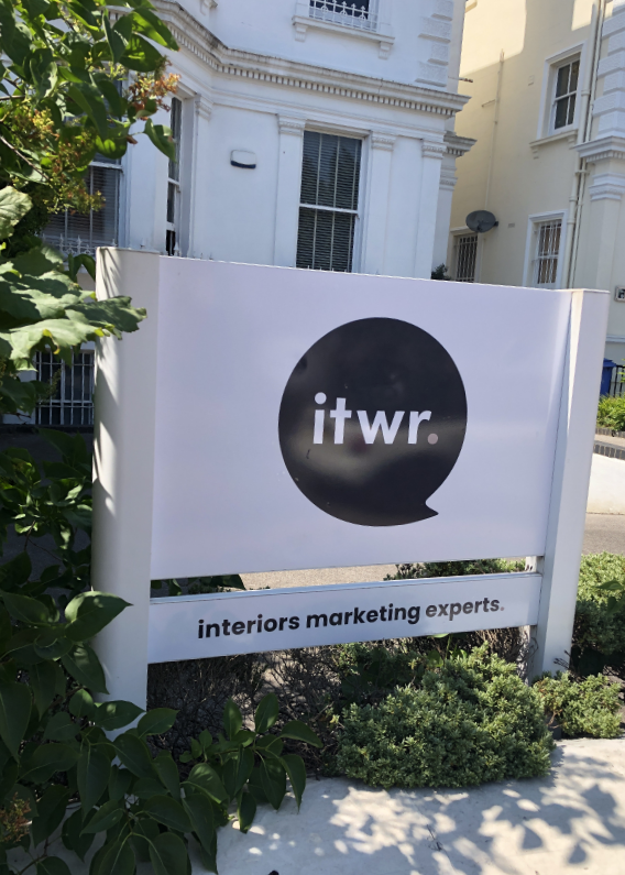
Once the direction for the brand was selected the logo was worked up in different variations until a final design and colour pallet were chosen. In the end simplicity and muted colours won out, whilst representing the company’s service it still allows the creative work to take centre stage.
What Branding is right for you?
Ready to sculpt your brand’s identity? Whether you seek subtlety or vibrancy I have you covered. Do you need a new logo or branding? Get in touch I would be happy to help.
